How To Make Your Home Unforgettable
It can be overwhelming to decorate your home, whether it's a 900 square foot space or a 5,000 square foot mansion. People from all over the US ask Erin and Ben to renovate their home, and while that would be an adventure for the Napier family of four, it's simply not doable. So most resort to asking for advice on home design and paint colors on online forums; those can be beneficial sometimes.
Yet there are always those haunting questions. What if you choose the wrong paint color for the main bathroom and end up with a headache instead of a personal oasis? What if that funky wallpaper turns out to be a trend you liked for a season, but now you hate it? What if your current decor taste doesn't reflect who you are in ten years? These are all typical concerns to have, and often, these questions leave us in designer's paralysis.
It's a state of feeling frozen, stuck, and ultimately aimless. It seems impossible to make a decision, but there's a way to get un-stuck, feel inspired, and confident in your choices. The key is creating one design feature in each room that makes you audibly say Wow, and then letting that feature steal the show.

For the Hogue House episode in season three, Erin and Ben designed a historic home for the owners of The 5000 food truck, Bill and Julie Hogue. With ten kids, their home had to be functional, spacious, and reflective of their personalities. If you've met Bill and Julie, you know they're some of the most hospitable people in Laurel. Often the Hogues and their food truck make the most delicious first impression on those who visit our hometown, so Erin chose to make their entry a complete showstopper.
View their Resource Guide here!

In season four, Erin and Ben created a respite for a pastor and his family that needed to customize their new space to fit their needs. Their experience in previous homes gifted to them by the church was that most homes were minimal in style or design. Since they wanted to settle in for a while, they needed a space to reflect their life well.
Ben built a big enough table for their dining room that fit their entire family, and Erin decorated it with bright color and accessories. It was a stunning, intentional way to customize their gathering space. View the Turner House Resource Guide here!

Erin and Ben experienced one of their "firsts" in season four in the Combe House — an unlimited budget! The most surprising element of the project was that Erin and Ben were more stressed with no budget than having a tight one. Still, they worked hard, designed smart and made sure to be respectful of John's wallet and trust. Together, they created a Spanish-style retreat that had stunning features that people are still talking about today. View The Combe House Resource Guide here!

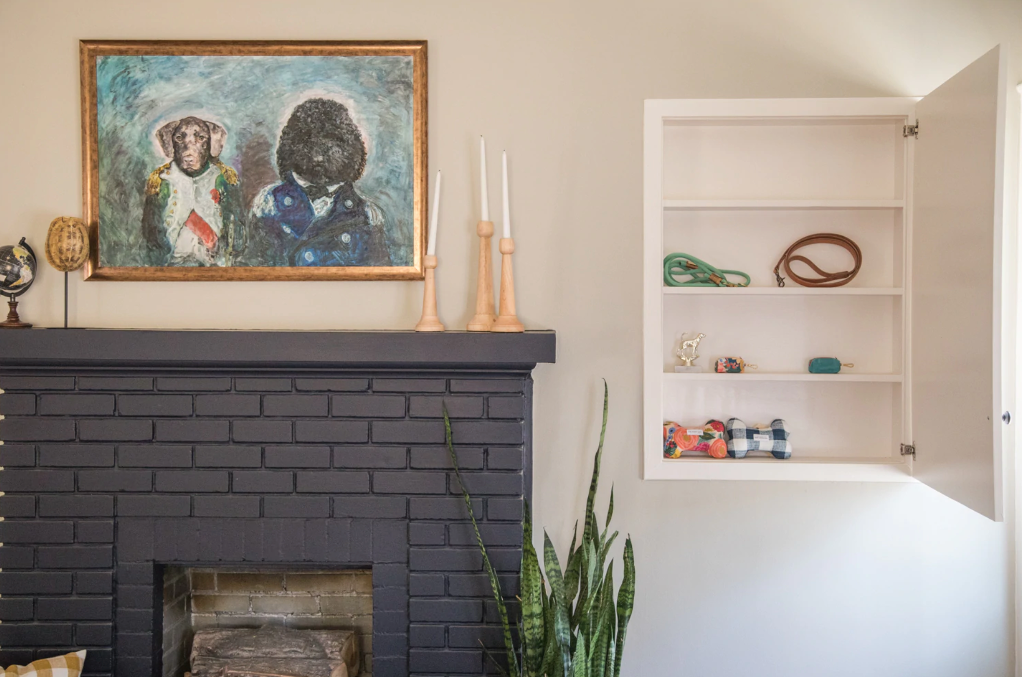
The Berry-DeMonte House was such a fun project. Erin and Ben wanted to reflect the couples' midcentury modern style with funky tiles in the kitchen, saturated greens and blues, and a staple piece in the living room. Erin commissioned a European-inspired portrait of the owner's dogs from famous Laurel artist and nationally-known art forger Mark Landis. View the Berry-Demonte House Resource Guide here!

Finally, take note of Erin's color choice in the Keith House. If you're looking to draw attention to your book collection, this is the proper way to do it. The entire house is filled with color, and you'll have to check out the dining room if you're flirting with the idea of wallpaper. View the Keith House Resource Guide here!

Here's your sign if you're looking for confirmation to go with that paint color that might be slightly off the wall (pun completely intended.) Create a room that inspires you and design daringly. It might surprise you how much one change can make all the difference!


